Rich Dad Stock Blog
Free Information to Help You Build Wealth in the Stock Market
Power Surge in Energy Stocks
Last week’s mention of the weakness in leading stocks like biotech prompted some insightful conversations in my recent Rich Dad® Education Trading Labs. Along with discussing potential adjustments to make in our trading we investigated which areas of the market may still be providing bullish opportunities. A brief survey of the major U.S. sectors found that energy stocks were sporting perhaps the most compelling setups.
Here’s a quick tip to save some time finding strong stock sectors. Rather than looking at the chart of each sector one after the other, use the sector rotation feature provided in the tools menu of the MachTrader software. After selecting “Tools”, hover your cursor over “Broad Markets” and a window will pop up that says “Sector Rotation: Sector SPDR PerfChart”.
When the interactive chart shows up change it to a histogram using the button on the bottom left (black arrow). Then, right click on the slider bar at the bottom right (blue arrow) and select “Past Week”. The standout in relative strength for the past week has been the energy sector besting the performance of the S&P 500 by 2.77% (red arrow).
The relative strength in the energy space is easily seen in the chart of the Energy Select Sector SPDR (XLE) which just broke out to a new multi-year high. Its recent consolidation has taken on the form of an inverted head and shoulders pattern provided further bullish implications for the budding sector.
With the broader market under pressure and many leading momentum stocks like Netflix (NFLX), Tesla (TSLA), Priceline (PCLN), and Solar City (SCTY) falling into downtrends, some may be wondering if they should even be considering new bullish trades at this juncture. The answer really depends on you. Some traders avoid entering any new bullish plays while the market is under pressure while others simply dial back both the amount and size of their bullish bets.
Here’s the key takeaway for me. Were I inclined to enter new bullish plays I would limit it to the best of setups in the areas of the market showing the most relative strength. If you’ve wondered where to look for stocks that are staying afloat amid the market’s recent swoon, wonder no longer. Take a gander at energy stocks.
Tyler Craig, CMT
Rich Dad® Education Elite Training Instructor
Biotech Bloodbath
Soaring Biotech stocks have soured this week. The beloved biotech sector – which I’m charting using the iShares Biotechnology ETF (IBB) – has been the champion of the ongoing bull market in U.S. stocks. The leadership in IBB really hit its stride in 2012 and hasn’t looked back since. Compared to the S&P 500’s 182% gain since March 2009, IBB is up a barn burning 368%. The bull market in biotech hit a snag this past month, though, and has now fallen some 15%.
So what do we make of the recent bloodletting? Is it a well-deserved bout of profit-taking or is a more ominous shift afoot?
I suspect it’s too early to tell. Let’s take a closer look on the recent damage suffered by IBB. Three bearish developments in particular stick out to me in IBB’s daily chart. First, the biotech ETF has fallen below its 50-day moving average for the first time in four months. Second, the downturn was accompanied by quite the volume spike. On closer inspection Monday’s volume of 6.5 million was the highest volume day in the ETF ever. Third, the swoon has been sufficient to reverse the short-term trend of the comparative relative strength.
 Source: MachTrader
Before declaring the bull run in biotech dead, however, allow me to mention a few counter-arguments. For starters, IBB has stumbled beneath its 50 MA numerous times in the past but successfully recovered from each downturn. Second, the weekly uptrend in IBB is well intact despite its recent plunge. The uptrend in relative strength also remains in place. If the selling frenzy is successful in turning these larger trends lower then traders should begin taking the weakness in biotech much more seriously.
The swiftness of the plunge in biotech is concerning to be sure. Traders hoping that the latest pullback in stocks will be short-lived should pay close attention to the action in IBB. If this once leading sector can begin to rise again it may well signal the broad market uptrend is ready to resume.
Tyler Craig, CMT
Rich Dad Education Elite Training Instructor
How to Spot a Market Top
Last week we celebrated the bull market’s fifth year anniversary. This week we look at a question I’ve received with increasing frequency in the past few months – how do you know the market has topped?
Short answer: you don’t… at least not until after the fact.
The hard cold truth is no one knows when our aging bull market will take its final gasp. There isn’t a tool or trick in all the world of Wall Street that can nail a market top – or bottom, for that matter – with regularity. While we can measure the median length of a bull market it provides nothing more than a ballpark figure. By definition half of all prior bull markets ended before the median while half lasted longer, with some lasting much longer.
Here’s a stat for you to chew on. Since 1871 there have been approximately 16 cyclical bull markets with the median bull market lasting 50 months. At five years old our current bull market has run 60 months. You might think knowing the average duration helps, but it really doesn’t help that much. Every bull market is different.
Another fact worth consideration is that four of the 16 bull markets lasted over 90 months. So while today’s bull market has eclipsed the magic median length there’s nothing to say it can’t continue for many months and maybe even years to come.
And what of technical analysis? Might we be able to use any of our whiz-bang indicators to increase our top spotting accuracy? Sadly, the answer is no. While we have tools aplenty to assess trend direction and momentum we’re unfortunately found wanting when it comes to forecasting both the magnitude and duration of a trend.
So instead of obsessing over every little dip and wondering if this selloff will be THE selloff, the plunge that finally fells the bull, follow the trend. Heed the time tested wisdom that a trend in motion stays in motion. While we can’t accurately predict the eventually length or height to which our mature bull market will climb, we can at least identify the current trend and the price levels which, if broken, will indicate the trend is finished.
Rather than getting caught up in the day-to-day machinations of the market consider using the weekly trend as your guide. Until we break any key support levels on this larger time frame the bull market remains well-intact. In the chart below I’ve drawn a couple key trendlines in green and red. At a minimum the S&P 500 needs to break below 1750 for us to talk seriously on whether or not the uptrend – and potentially bull market- is toast. Until then any talk of the bull market being finished is premature, highly speculative, and lacking any real confirmation.
 Source: MachTrader
Tyler Craig, CMT
Rich Dad Education Elite Training Instructor
Sector Rotation – The Lifeblood of a Bull Market
Last Thursday marked the five year anniversary of the aging bull market for U.S. equities. Since the infamous “devil’s bottom” on March 6, 2009 the S&P 500 Index ($SPX) has climbed an impressive 181% from 666 to 1873. As with all bull markets, sector rotation has played an integral part in propelling stock prices to their now lofty heights.
Pro Tip: Sector rotation refers to the movement of money from one stock sector to another over time.
Sector rotation is what allows a broad index – like the S&P 500- to continue climbing day after day without experiencing a major downturn. Here’s how it works. Let’s say the consumer discretionary sector is leading the market but becomes a bit overbought and in need of some type of correction. For the next few weeks this profit-taking may takedown the sector a notch or two. At the same time suppose money flows into a previously lagging sector like financials making it the new leader. The net effect of this rotation prevents the pullback in consumer discretionary stocks from dragging down the entire market.
As long as we see money flow into a weak sector when a strong sector gets hit the broader market should stay afloat. It’s when we see money come out of all sectors en masse that you should start to worry.
The other dynamic to consider is the tendency for a bull market to eventually rise all boats. Though a particular sector like energy or technology may drop for a spell, the weakness won’t persist if the bull market remains on track. Eventually the optimism will spill into these underperformers and lift them higher.
We’ve seen just such a shift in the financial sector this week. As shown in the chart below the financial sector (XLF) lagged the rest of the market for the first two months of 2014. Since the beginning of March, however, money has flooded into this area making it the new leader.
Here’s the bottom line. Don’t count out lagging sectors. Provided the broader bull market persists, money will eventually rotate back into these areas as. Use the Comparative Relative Strength study (CRS) to identify when they start leading again.
Tyler Craig, CMT
Rich Dad Education Elite Training Instructor
Commodity Comeback
On both an absolute and relative basis commodities as an asset class have largely disappointed investors over the past few years. While stocks rocketed into the stratosphere most commodities floundered in 2013. The gold market was an especially sore spot falling over 28%.
Though there are a number of commodity related indexes and exchange traded funds (ETF), one of the better ones I’ve come across is the Thomas Reuters Equal Weight Continuous Commodity Index – chartable using the ticker $CCI at stockcharts.com. The CCI features 17 commodities from gold, silver, and crude oil to sugar, soybeans, and wheat. Each commodity is given equal weight to avoid any one sector having undue influence.
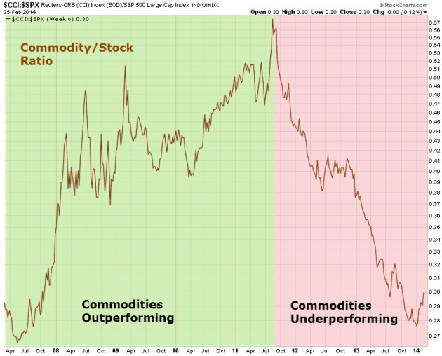
To view the relative performance of commodities we can use the commodity/stock ratio. As with all ratios, when the line is rising the asset in the numerator (commodities in this case) is outperforming. When the line is falling the asset in the denominator (stocks in this case) is outperforming. Since peaking in mid-2011 the ratio has tumbled, recently reaching a new 6-year low.
Source: StockCharts.com
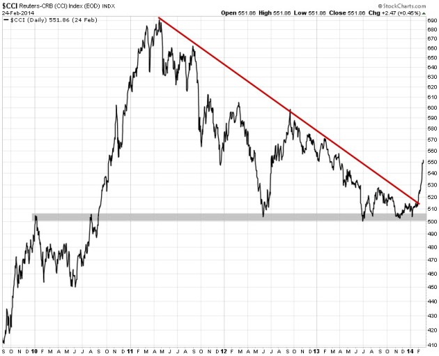
Despite the massive underperformance in commodities, however, they’ve kicked off 2014 with a bang. As shown below the CCI has formed a multi-year descending triangle. The bulls have defended the $500 zone multiple times leading to this year’s breakout of the falling trendline. The $CCI is up 8% so far leaving both stocks and bonds in the dust year-to-date.
Time will tell whether or not commodities will continue to see capital inflows. If you haven’t looked at commodity related stocks and ETFs recently, take some time to look this week. GLD, SLV, UNG, GDX, and SIL have all shifted back into bull mode.
Tyler Craig, CMT
Rich Dad Education Elite Training Instructor


